
Did thedonald.win Turn against Fox News after the Election?
It must take a special kind of self-restraint for a certain kind of American liberal not to luxuriate in the MAGA faction’s apparent mutiny against Fox News, perhaps for the same reason that the neocon mutiny against Trump was a kind of heroin for them. There’s nothing better than an enemy wracked with turmoil, and there’s no tranquilliser more powerful than the grudging testimony of the other side.
To drink this potent elixir you’re best off going to the source, which in the case of MAGA has to be thedonald.win. I’ll happily admit to having started checking in on the reluctant orchestra myself at intervals since Election Day. It’s all kind of fascinating and probably no worse a way of spending one’s time than watching some or another Netflix show. You can’t have spent any time there recently and not have noticed that these people hate Fox News. But when did that begin? In particular, did it start around 11:20 p.m. on election night when Fox called Arizona?[1] That question came up recently and I wanted to get some quantitative evidence.
Edit 2023-07-02: As of 2 July 2023, thedonald.win is now available at patriots.win after an internal power struggle resulted in a split between the domain owner and the (less moderate) moderators.
Methodology #
I started by scraping all the snapshots of the /top page that were available on the Internet Archive from 1 September to 21 November (the day of my programming this). That meant (programmatically) opening each visible post in each snapshot and scraping all visible comments in that post. This gave me 730K comments which I whittled down to 66K by removing empties and combining duplicates (always taking upvote and downvote amounts from the latest observation).
I considered a comment to be about Fox News simply if it contained the word “fox” or “faux”. I also wanted to look at Fox’s two little siblings and so did the same for One America News Network (“oann” or “one america news”) and Newsmax (“newsmax”). But I only considered comments that contained exactly one of these, because the comments that contained more than one often made a comparison, such that it’d be inappropriate to calculate a single sentiment score for the whole comment.
I used sentimentr to calculate the polarity sentiment of each comment. (I’ll use the word sentiment here to refer to the sentiment analysis done by sentimentr. I’ll use attitude to refer to what thedonald.win’s users actually think, that is, the thing that I’m trying to estimate.) sentimentr does account for valence shifters to some degree – in other words, it tries to make a difference between “Fox is good” and “Fox is not good” or “Fox is bad” and “Fox is very bad” – but it is not perfect.
Here are the most negative sentences about Fox News in the data set:
| Comment | Sentiment |
|---|---|
| "Trump warned us about the enemy within – RINOS and FOX – we need to nuke this cancer before we go onto destroying the puppet masters of the weak minded." | -0.85 |
| "Fuck the FBI, fuck Fox News." | -0.82 |
| "Which explains why Fauxi basically said masks were stupid and useless early on, but now it's a crime against humanity to not wear one." | -0.82 |
| "Fake Fox is dead to me." | -0.71 |
And the most positive:
| Comment | Sentiment |
|---|---|
| "YES! CONFIRMED BY FOX NEWS!" | +0.53 |
| "Well...Fox is controlled opposition and they proved that, so it's more than just the cool thing to say ya know?" | +0.50 |
| "That is one fine-looking foxy female ...said no one ever, not even inmates locked in prison for the past 30 years" | +0.47 |
| "Link, source? I dont TV and I dont eat fox news ads. Please forgive." | +0.44 |
So you see both a false negative and several false positives there, but at least the comments with low sentiment seem to be more negative than those with high sentiment. Since we’ll only be interested in comparing scores from different segments, that’s really all we’ll need. Still, as you read on, remember that this signal is noisy.
Edit 2023-07-02: If I did this in 2023, I would use an LLM to analyse the sentiment of these comments. I expect that would be far more reliable than sentimentr. In fact, I could have done so when I wrote this post in 2020 – the GPT-3 beta had been released earlier that year – but the use case had not yet struck me.
I then set about converting the upvotes and downvotes into a combined and standardised value. Upvotes and downvotes were both distributed exponentially so I started by taking the logarithm of those. Then I just computed the difference, so log(upvotes + 1) - log(downvotes + 1). That means a comment with +9/-0 got the same value as one with +99/-9 and one with +999/-99 which seemed fine to me. Finally I scaled the computed values to have mean 0 and standard deviation 1.
Next, we have to take into account that this voting score depends both on the voters’ attitude and the sentiment of the comment. For positive voters and a positive comment we expect a high voting score, but for positive users and a negative comment we expect a low voting score. That means we probably can’t just look at the sentiments themselves.
As you’ll see soon enough, I started analysing the data by taking only the comments with a voting score over the mean (so relatively well-received comments) and plotting the sentiment density for those. That already gave me a pretty good idea of whether attitudes changed towards Fox News after election night. But it didn’t really use the information in the voting score. If a positive comment about Fox was downvoted to hell, that tells us something about the users’ attitude towards Fox. Fortunately, there was a simple solution to this. I swiftly constructed a Bayesian multilevel regression model with partial pooling.[2] That gave me more proper estimates of users’ attitudes towards the three news channels.
If you want to have a look at the code, I’ve put it up on GitHub. The code is written in R and the model uses Stan.
Results #
This graph shows the density of sentiment towards Fox News in relatively upvoted comments, before and after the election:
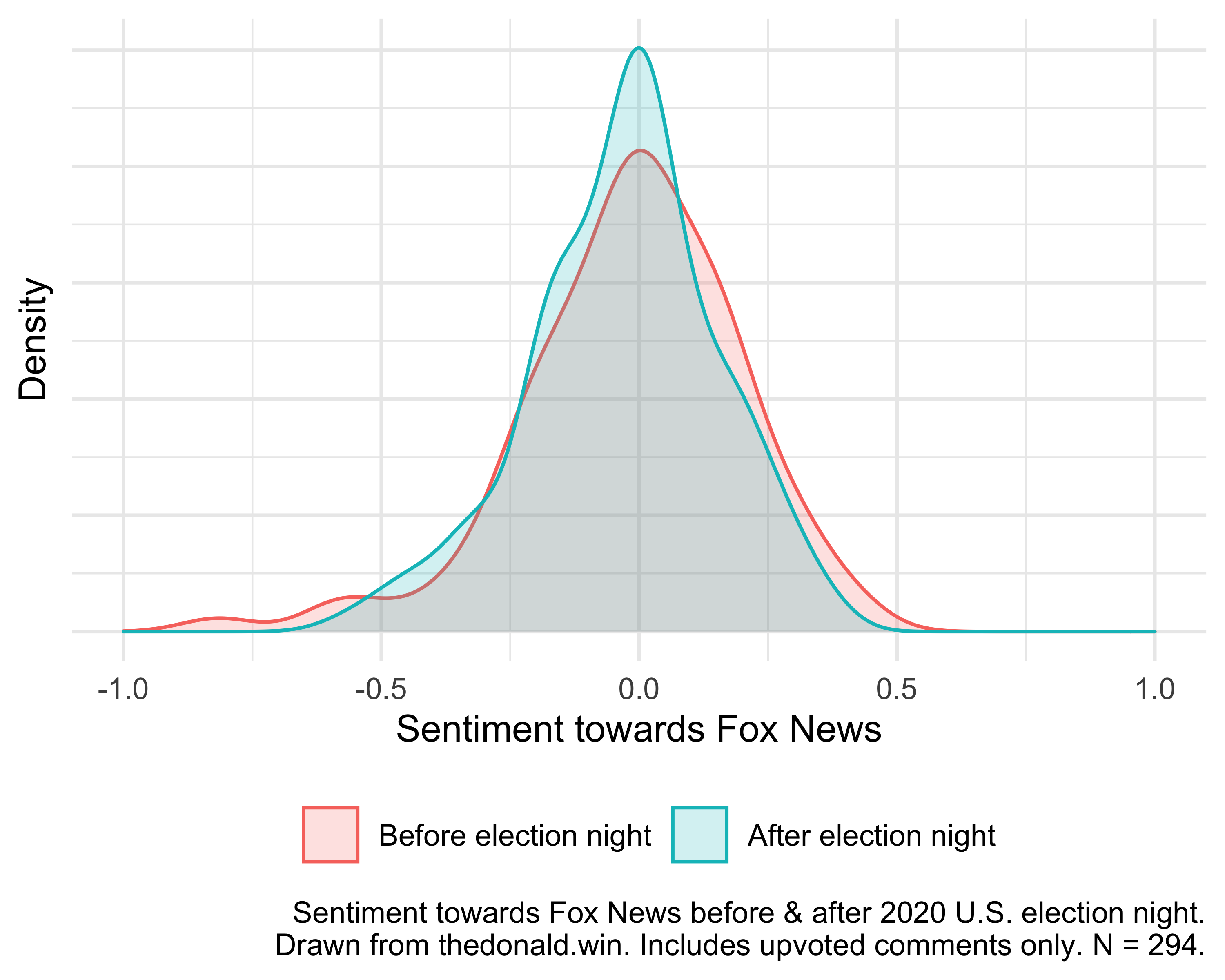
As you can see (or not, if you’re colour blind – sorry), the post-election distribution looks shifted somewhat to the left as compared to the pre-election distribution, suggesting sentiment deteriorated somewhat after election night.
Here’s how Fox News compared to OANN and Newsmax across the whole data set.
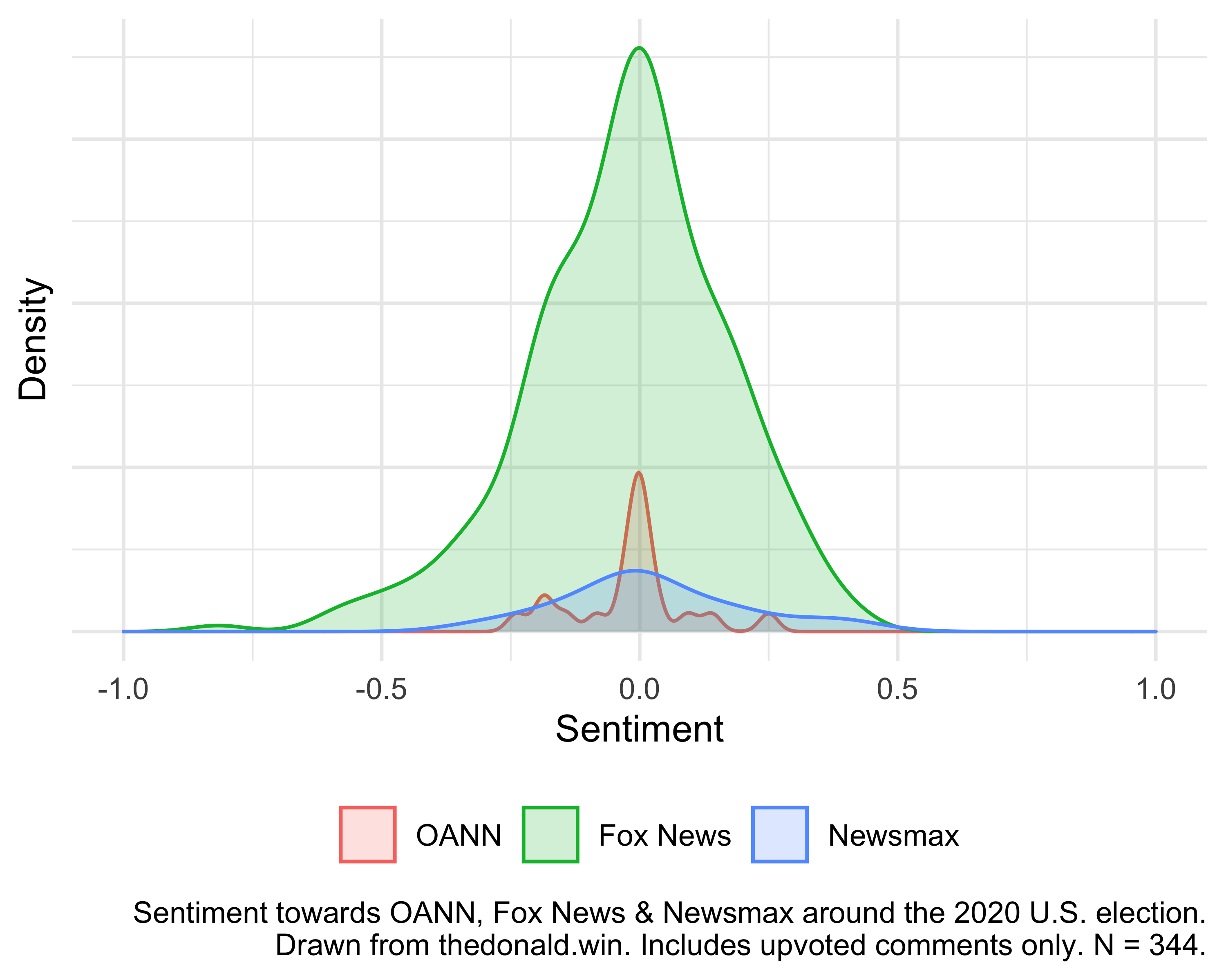
The area of the Fox News density is much larger than the others because I scaled the three groups to be proportional to their sample sizes: there are many more comments about Fox News in the data set than there are about the other two. There’s not much more to say here. I don’t know why the three distributions have different shapes. If there are any effects here, they are pretty small and it’s hard to tell from the graphs alone if there’s really something there or not.
Which is why I also modelled the problem, using sentiment and voting score to infer attitude. A Bayesian model outputs posterior probability distributions. To compare two groups we calculate the difference between their posterior distributions. That’s called the contrast. Here I wanted to know the contrast between the post-election and pre-election groups. This plot shows just that for each of the three news channels, with 89% percentile intervals.
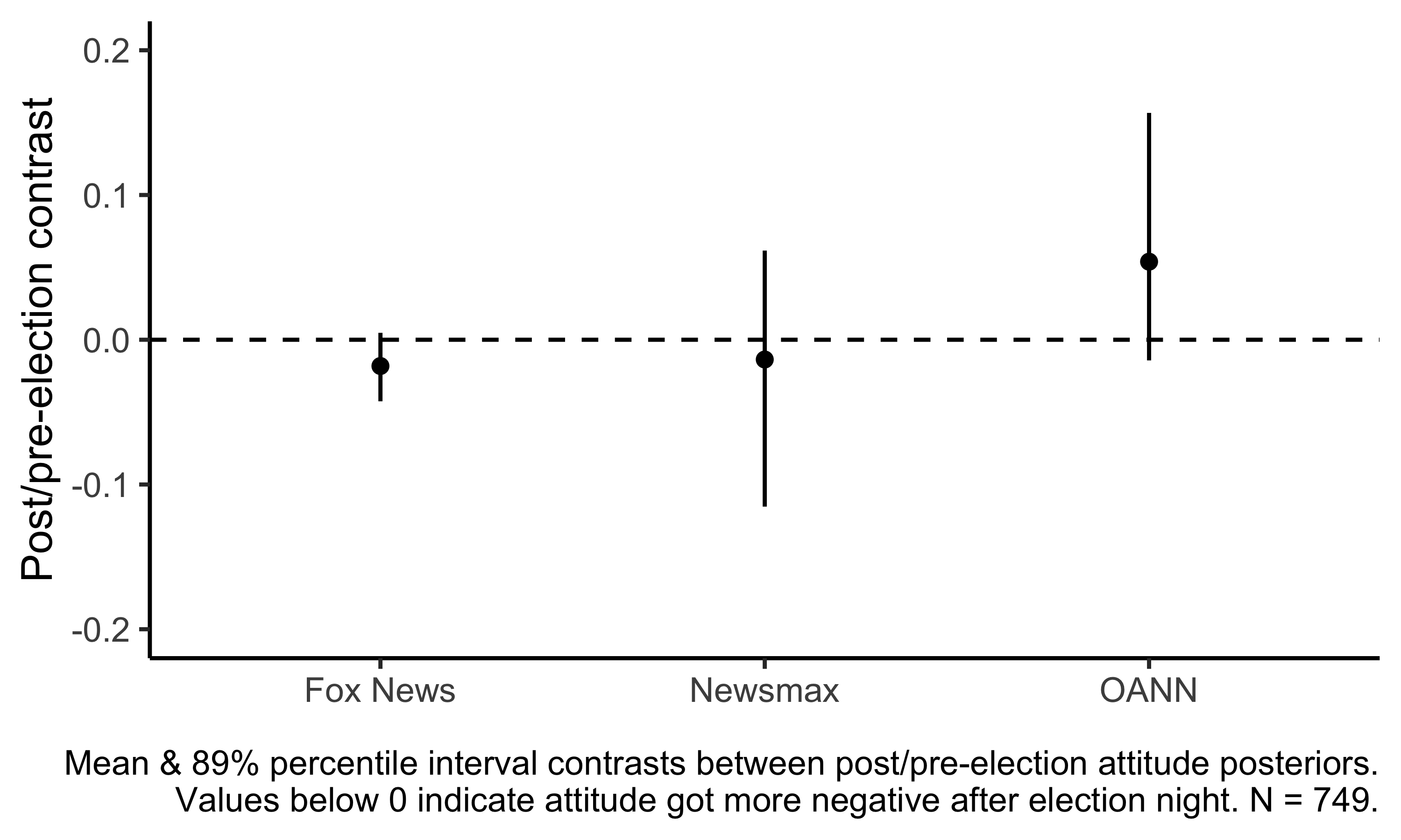
In numbers, the model is
- 89% sure that attitudes towards Fox News deteriorated after election;
- 85% sure that attitudes towards OANN improved after election; and
- 54% sure that attitudes towards Newsmax deteriorated after election.
Of course this is under all the previously stated assumptions, and the effect sizes involved look very small. “Deteriorated” and “improved” here include truly miniscule changes in attitudes (as well as substantial ones). There are very few comments about only Newsmax or only OANN before the election (N = 5 and N = 16 respectively, compared to N = 239 for Fox News). That’s why the uncertainty bands are larger for those two. But most fatal is probably the dodginess of the sentiment analysis, which is noisy and has both false positives and false negatives. If I’d had more time, I would have considered labelling the data manually. But there it is. Make of all of this what you will.
Addendum 2023-07-02: I now think the effects I find here are indistinguishable from noise, especially given how unreliable the sentiment analysis tool I use was. I do think MAGA people really did have a less positive attitude towards Fox News after the election, but I think so more due to what I have read from them and in newspapers, and less due to any quantitative analysis.
Newsmax saw soaring ratings around December 2020 and January 2021 (and, interestingly, evidence from the Dominion lawsuit shows Fox executives were worried about losing viewers to Newsmax after the election), though they had declined by >50% by mid-2021. They then soared again after Tucker Carlson was fired from Fox News earlier this year. Aside from questions of partisanship, Newsmax is apparently just far more dull than Fox News.
Footnotes #
Of course Fox News ended up being correct on Arizona, but it was still probably a premature call. “I think there are some people that still think that might have been a little bit early”, former White House press secretary and modern-day Cicero Sarah Huckabee Sanders said shortly thereafter. And among those people was Nate Silver. ↩︎
I’m not an expert in statistical modelling so there may be bugs in there. But the results make sense to me and agree reasonably with my naïve plots and with my priors. Most of what I know about this stuff, I’ve learned from Richard McElreath’s outstanding book Statistical Rethinking. ↩︎